The importance of balance (compositional technique)
Hi, and good morning or evening - depending on where in the world you are - I hope you're having an awesome day. I want to talk a bit about composition.
I think the best way to learn composition is to learn it by studying paintings and art books rather than photography books. Simply because there are way more materials out there - usually of better quality as well.
The principles are all the same except that on painting the artist has unlimited ways and time to compose, whereas in photography - especially in street photography, you don’t have that luxury.
A composition in painting takes place before the effect as opposed to photography, where it mostly takes place after the effect. You choose the photo with the best composition after it’s made - you don’t choose the composition before.
One of the compositional techniques that create visually pleasing images is the principle of visual balance.
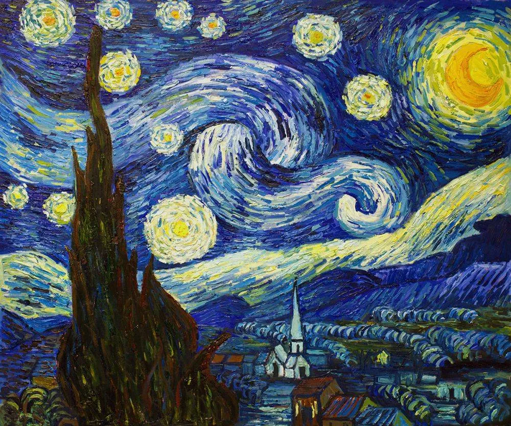 Vincent Van Gogh
If you look at Vincent Van Gogh’s Starry Night oil painting from 1889, you’ll see that it’s a very well balanced picture. The curvy cypress tree on the left is a really heavy element. Try to imagine the painting without the swirly wind and the moon. It would feel as if everything would tilt to the left (at least for me).
So, just as in paintings, a photograph needs a certain visual balance. Otherwise, it might feel too heavy on one side and not as visually pleasing. Even people who know nothing about art or composition would feel that something’s off if the composition is weak.
Of course, as with almost all of the rules, you can deliberately break them. That is if you know what you’re doing. If you don’t know what you’re doing, it’s better to follow the guidelines that have proven to work. E.g., in fashion - it’s generally a very bad idea to tuck your tie inside your trousers, but it can be pulled off if the person knows what he’s doing. Art is no different.
Things that create visual weight can be literally anything - contrast, faces, text, light, shadows, objects, negative space, etc. However, it’s easier to go by the “feeling” rather than to try to break these things down logically.
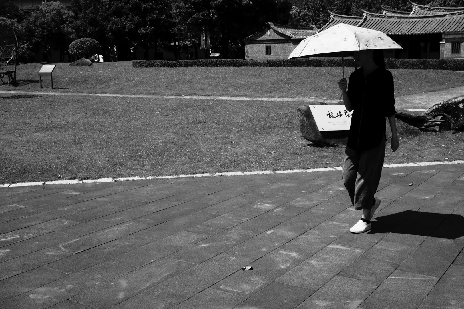
Take a look at the photo below:
 Taipei, 2019
It’s evenly balanced by the dark and white areas - almost equal in size.
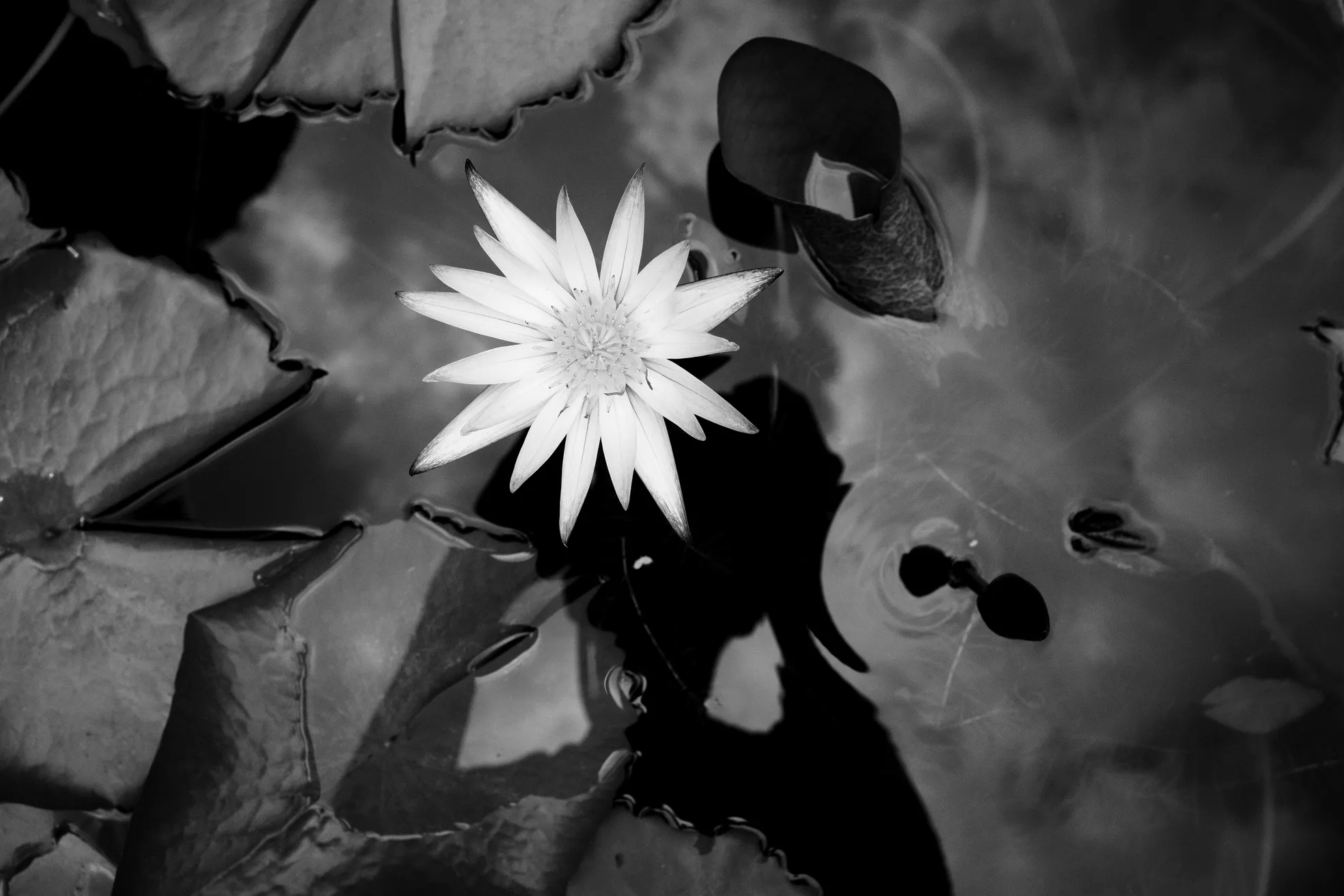 Taipei, 2019
Whereas the one above is unbalanced - the flower is too “lonely.” Making it a bit bigger (taking the picture closer), helps to balance things out a bit:
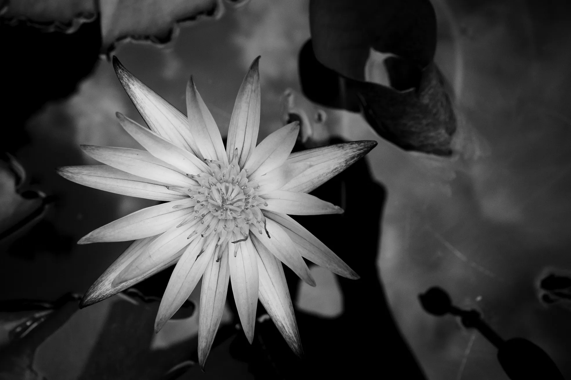 Taipei, 2019
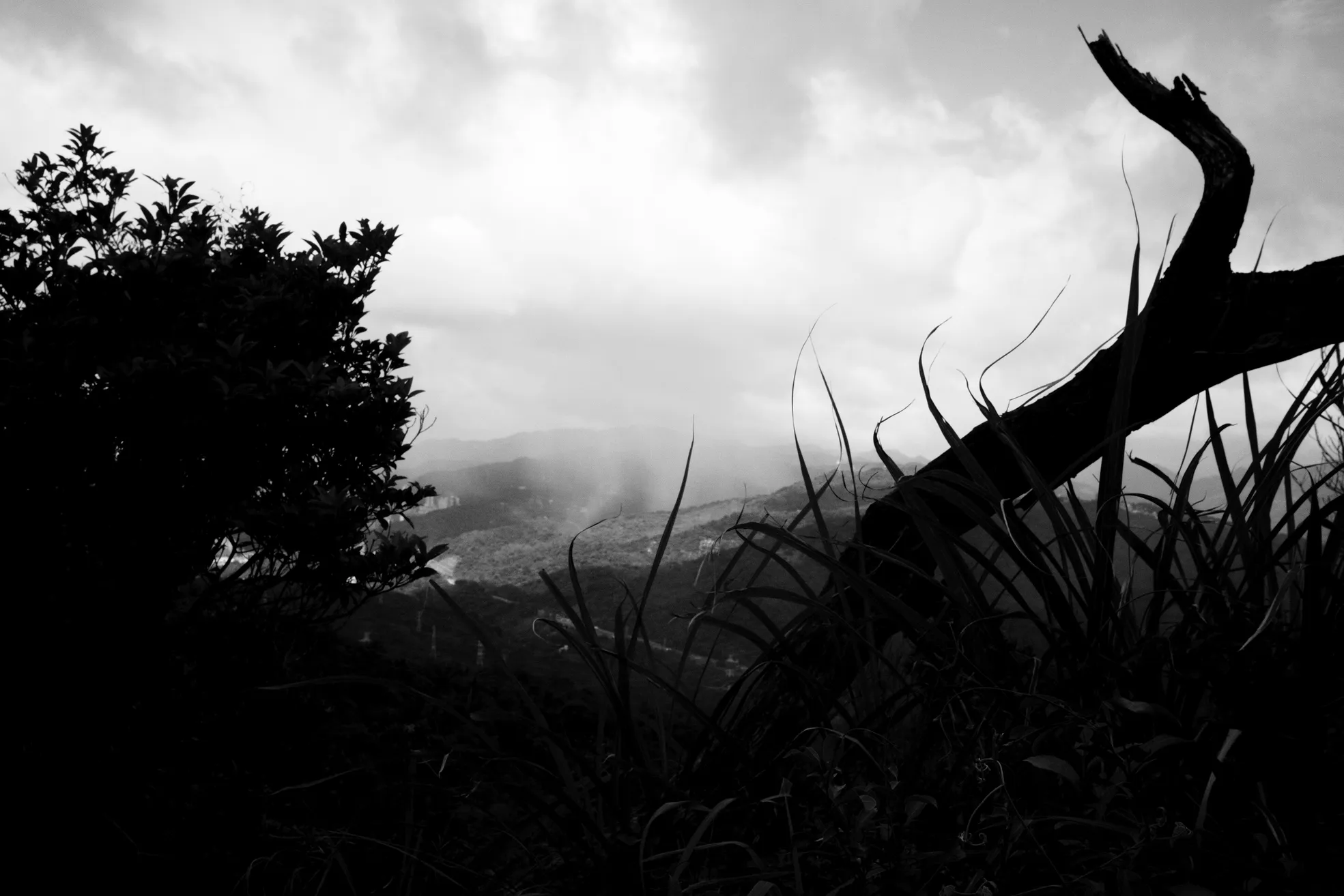
Another visually slightly unbalanced photo:
 Taipei, 2019
There's nothing on the left side. On a side-note: the two leading lines help to guide the viewer to the subject, but that's another story - another article.
Just to clarify: simply because the photo lacks balance, doesn’t necessarily mean that it’s a bad photograph, but in my opinion, balanced ones feel more “complete” - it creates a stronger composition.
Again, there's no right or wrong. The purpose of this was to just give some thoughts.
KRISTJAN
← back to home